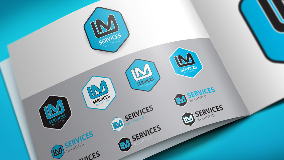

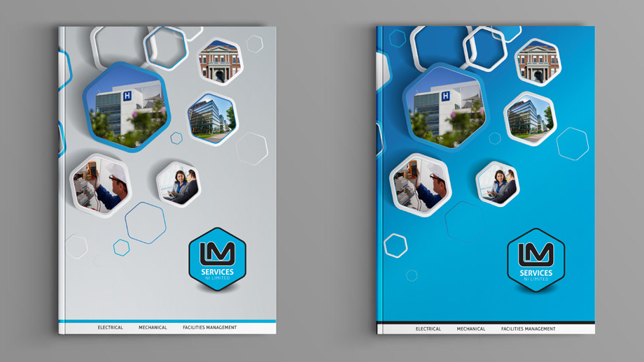
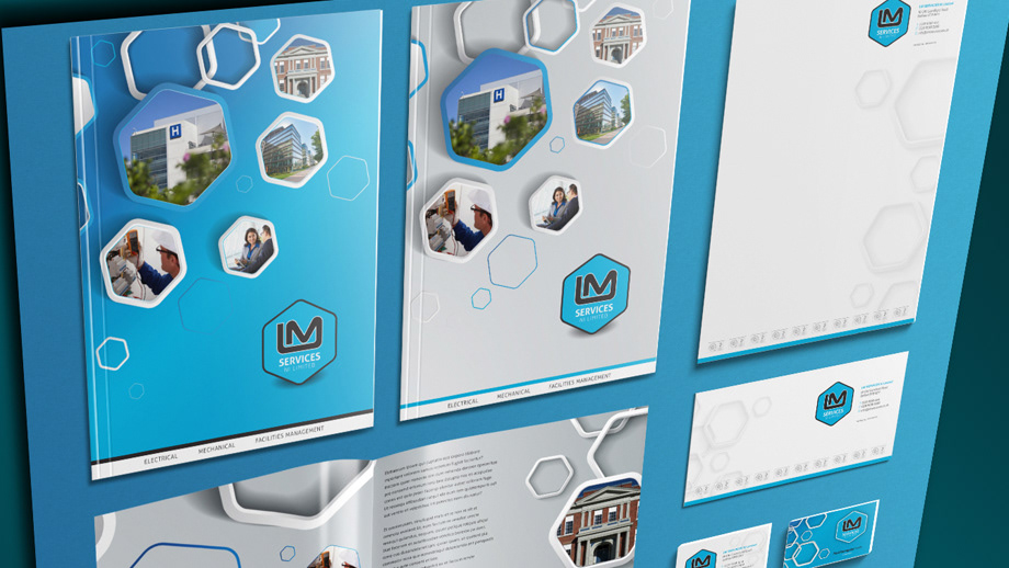
We were asked to produce a Re-brand design for LM SERVICES. They wanted to retain aspects of their existing logo in terms of colour but required a complete makeover. We gave them new fonts as well as a hexagonal design device to signify the company’s Northern Ireland roots as they grow into GB and European markets. The result was a clean and crisp logo which we also applied to stationery and corporate literature materials.