Reformer Lab Brand Identity Design
The Background:
Reformer Lab is the name given to an exciting brand-new Pilates company established in Northern Ireland. As a new venture, the client was eager to craft a brand that immediately instilled credibility and authenticity in this competitive marketplace.
The Objective:
Authenticity in Design: The logo and overall design needed to reflect the core values of Reformer Lab – precision, strength, and elegance. We considered incorporating elements that symbolize these qualities, through clean lines and a modern aesthetic.
Distinctive Branding: We needed to ensure that the branding stood out from competitors. This could be through a unique colour palette, typography, or visual elements that differentiate Reformer Lab from other Pilates studios in Northern Ireland.
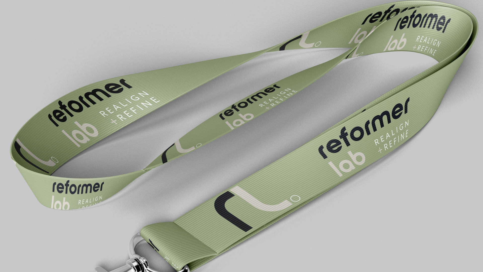
Consistent Branding Across All Touchpoints: From signage and marketing materials to staff clothing and studio decor, maintain a cohesive brand identity across every client interaction. This consistency reinforces Reformer Lab’s professionalism and reliability.
By focusing on these aspects of branding, Reformer Lab could establish itself as a trusted and respected name in the Northern Ireland Pilates scene, attracting clients who value quality, authenticity, and innovation.
Our Approach:
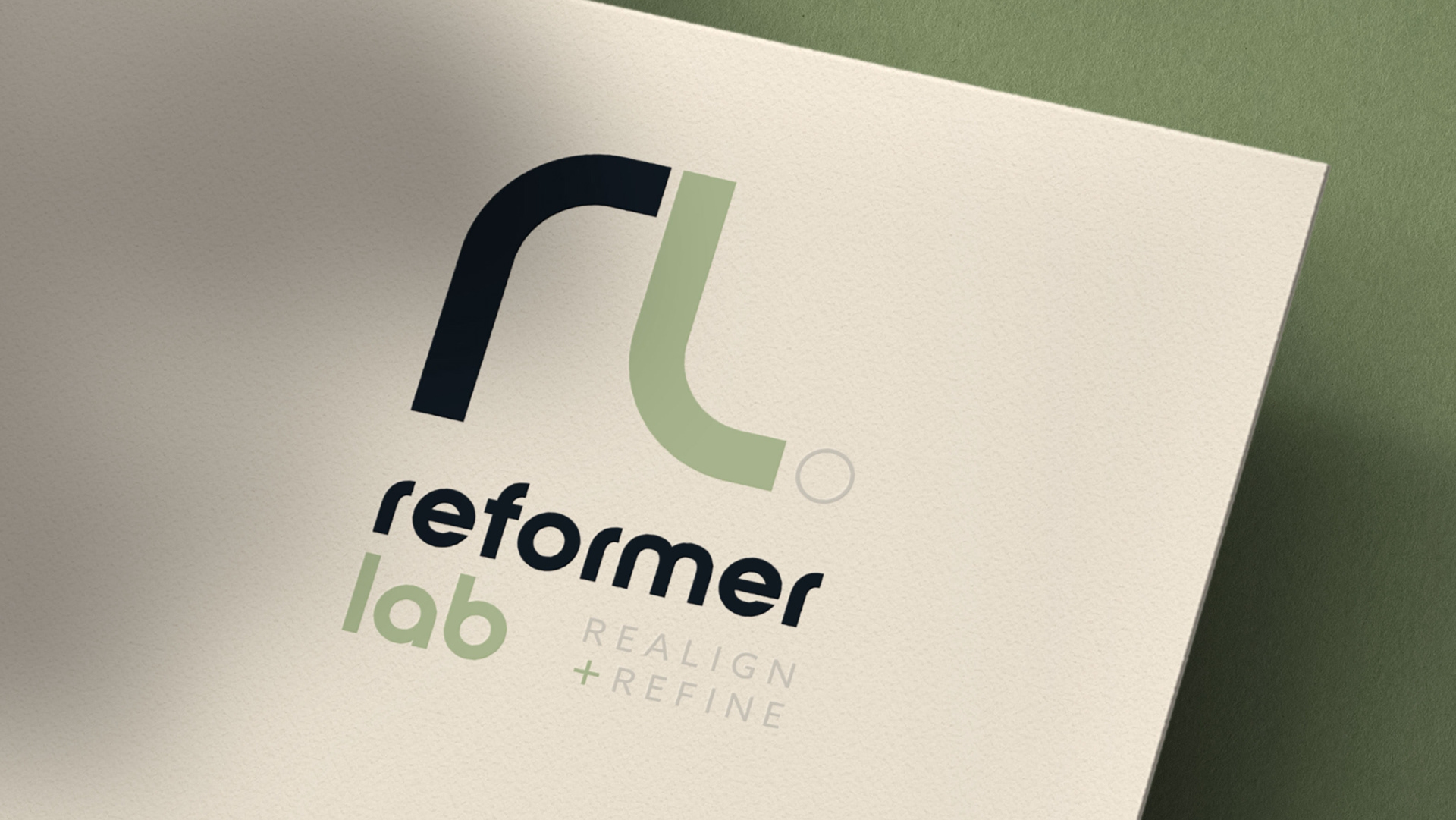
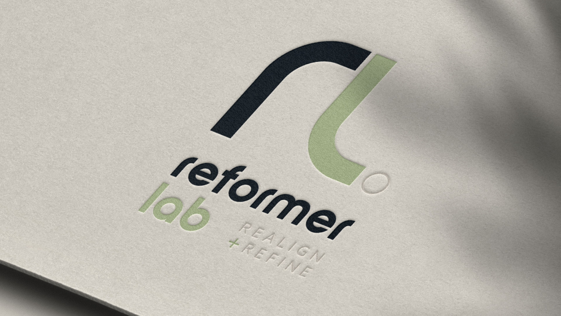
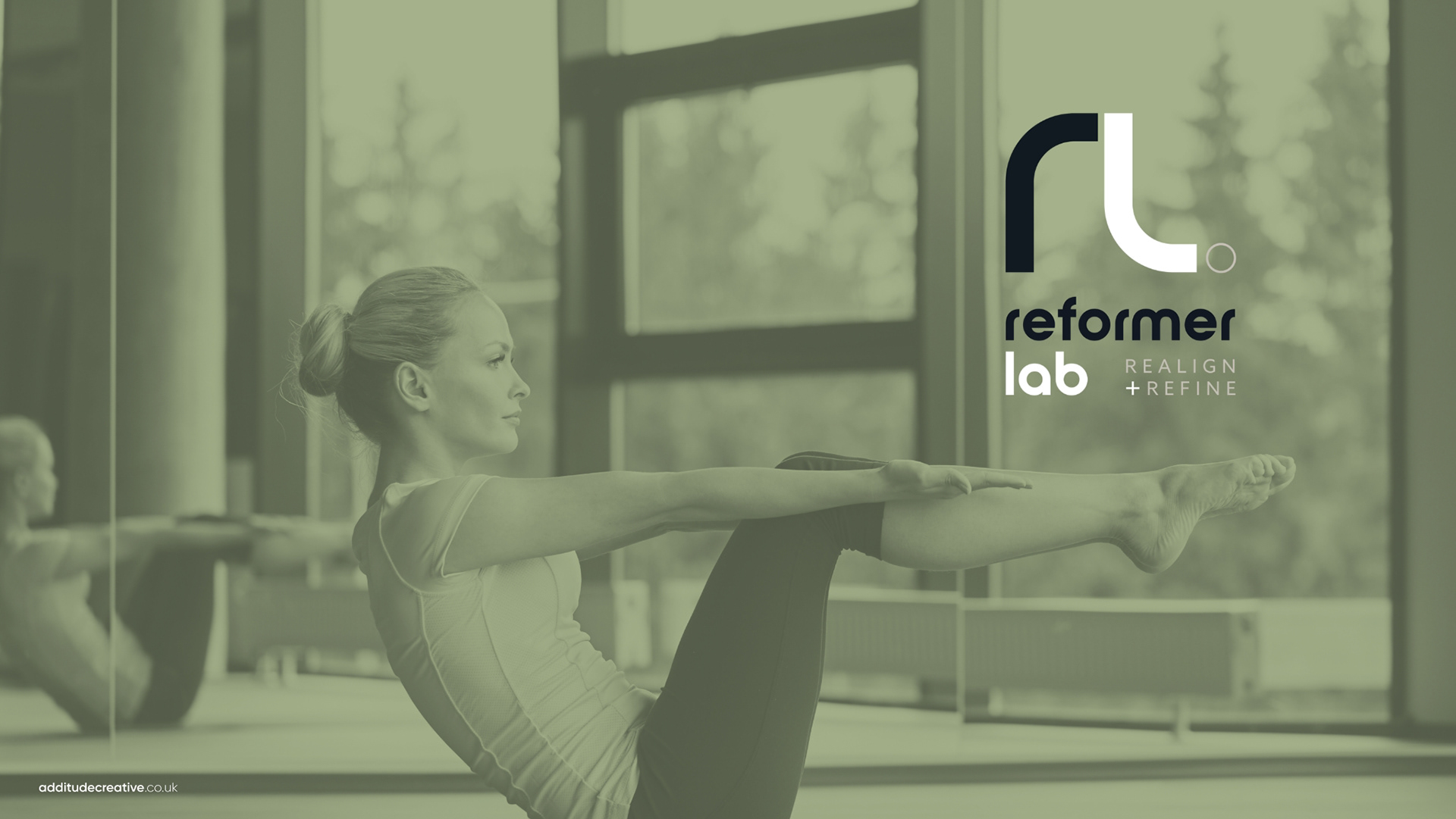
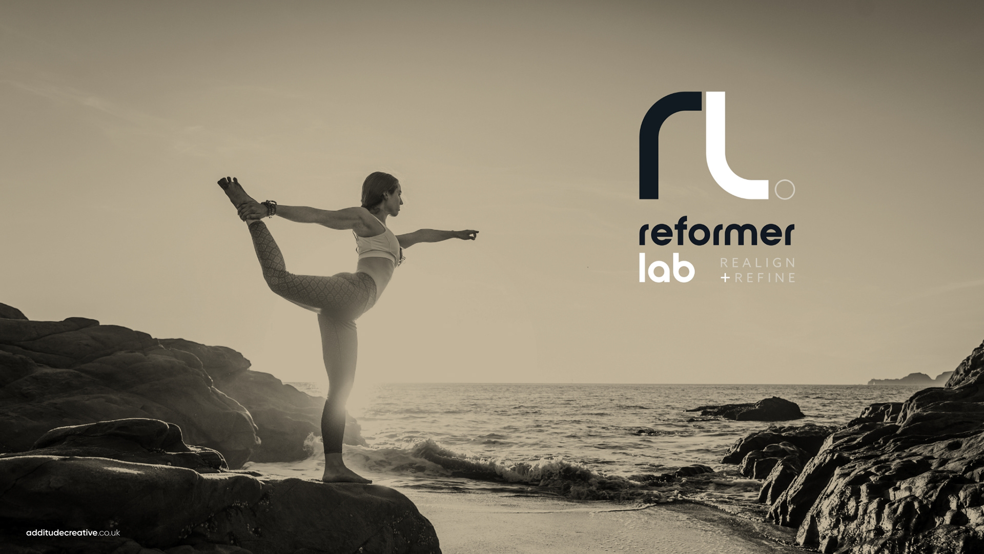
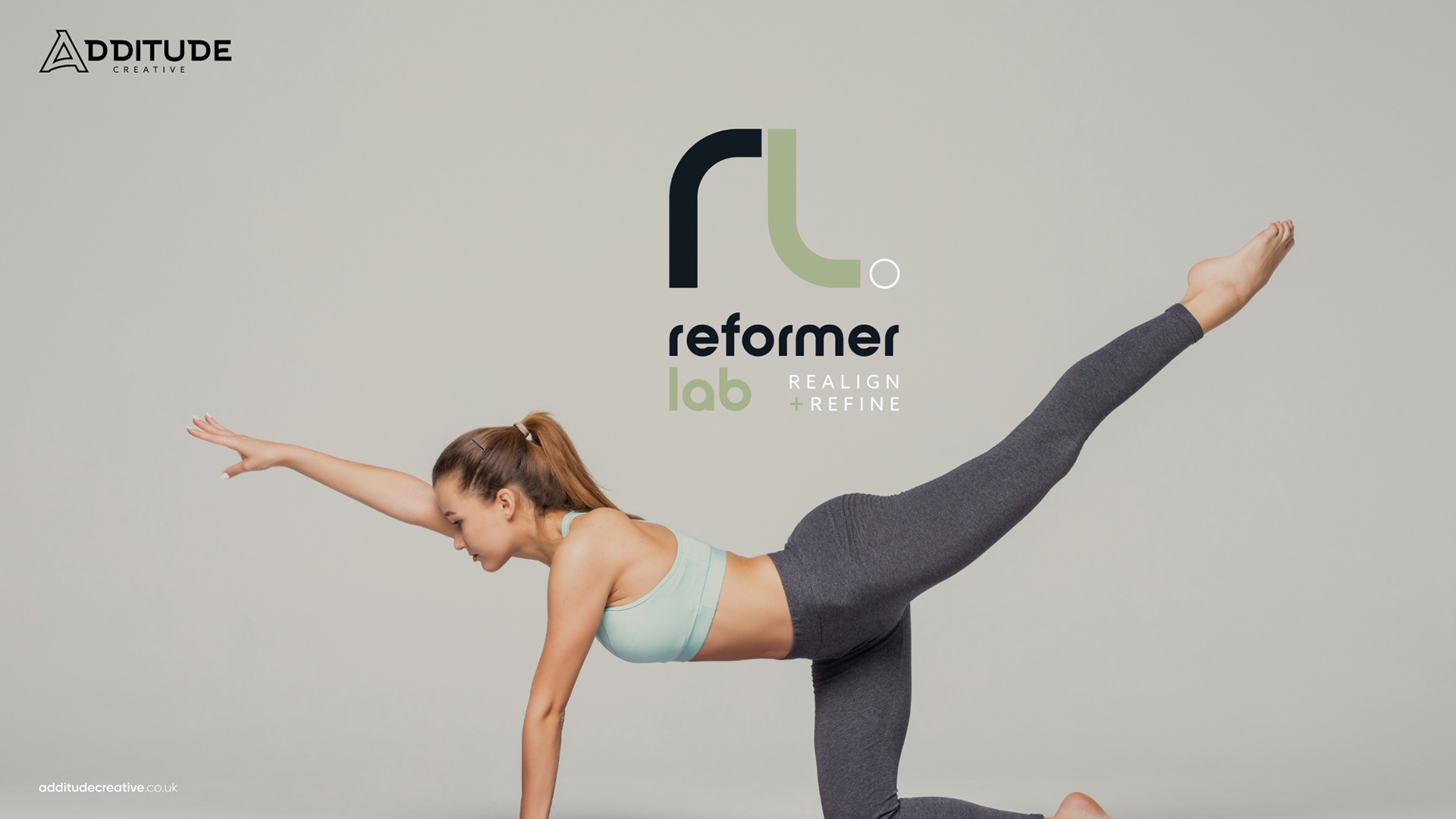
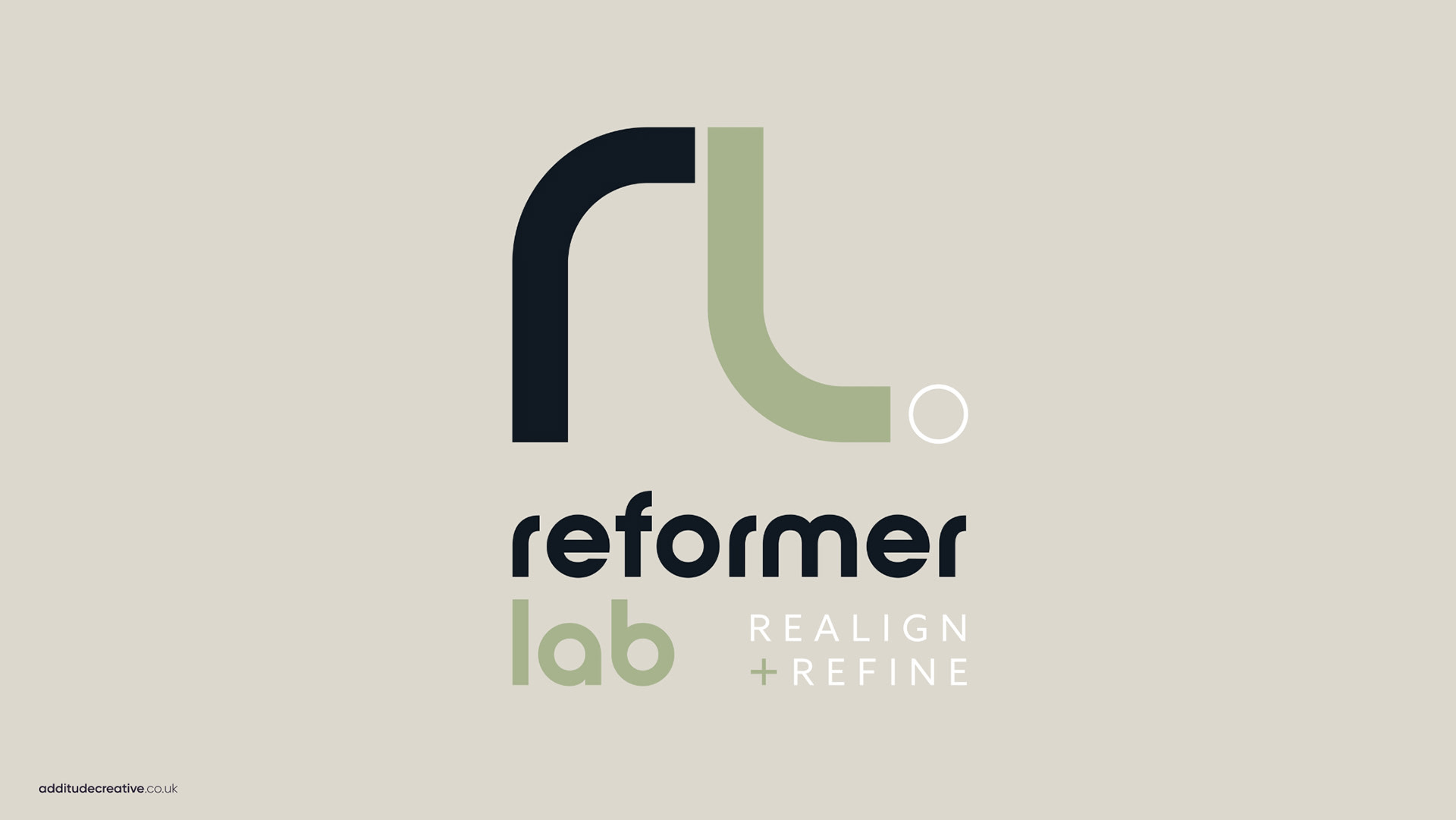
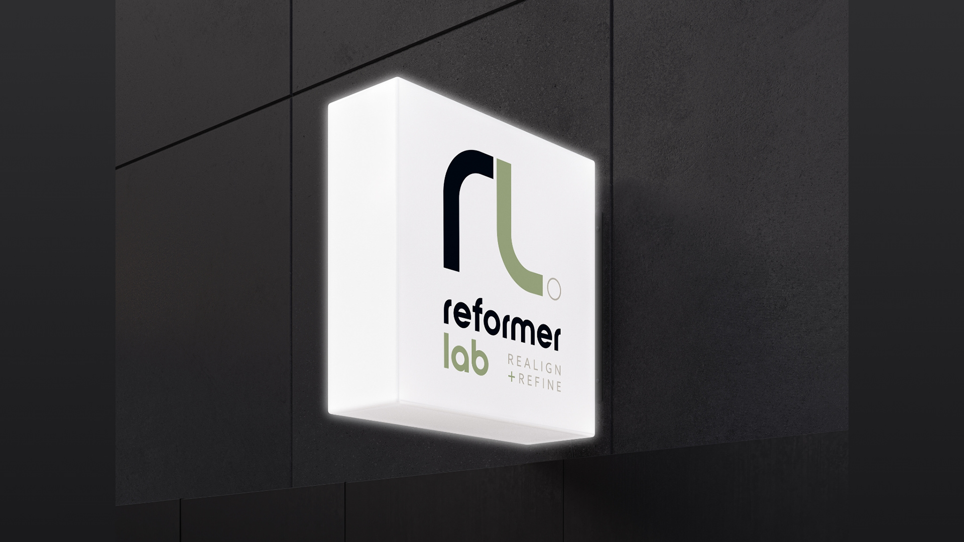
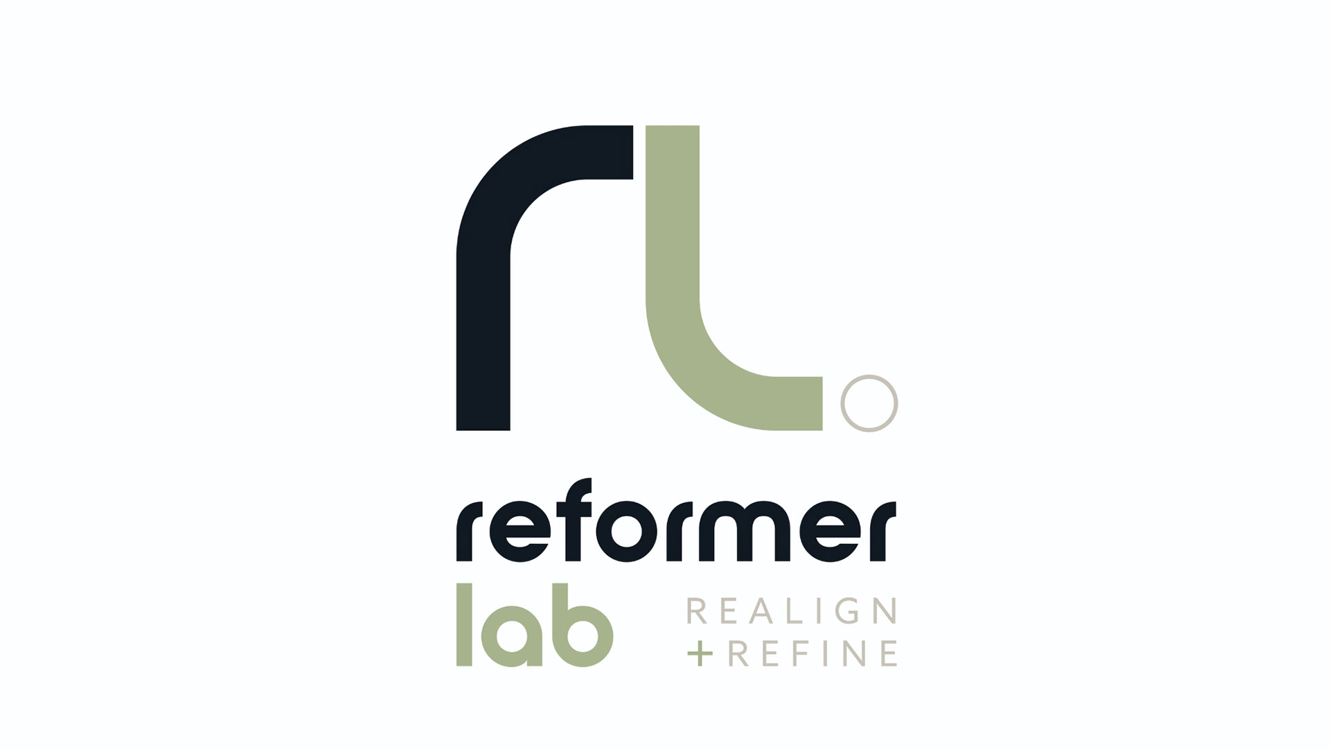
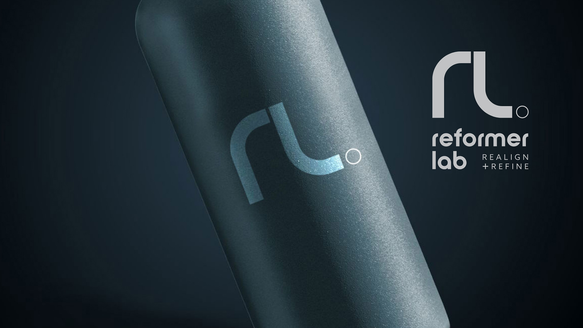
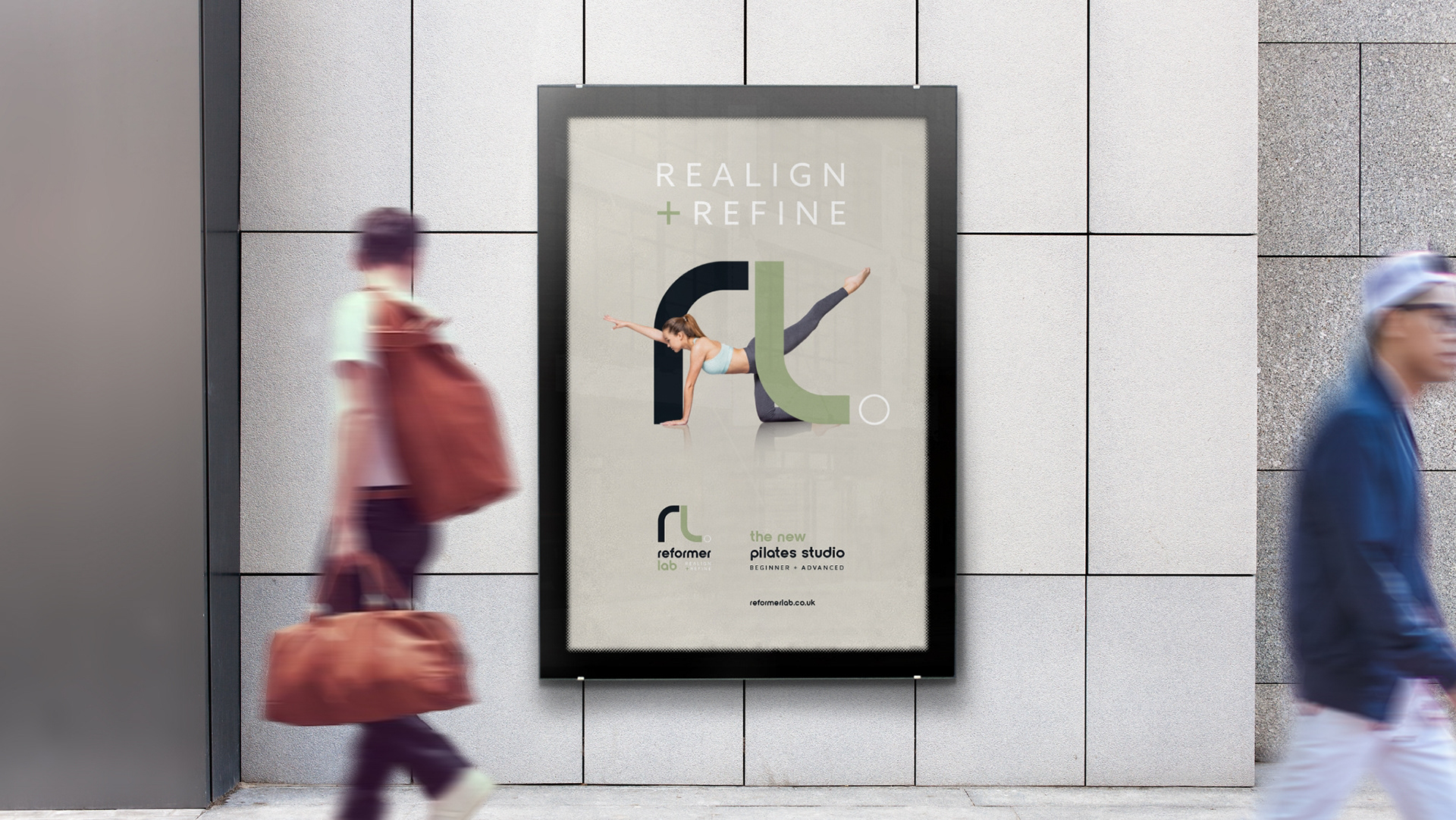
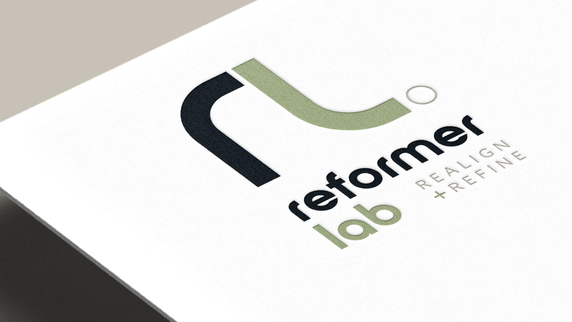
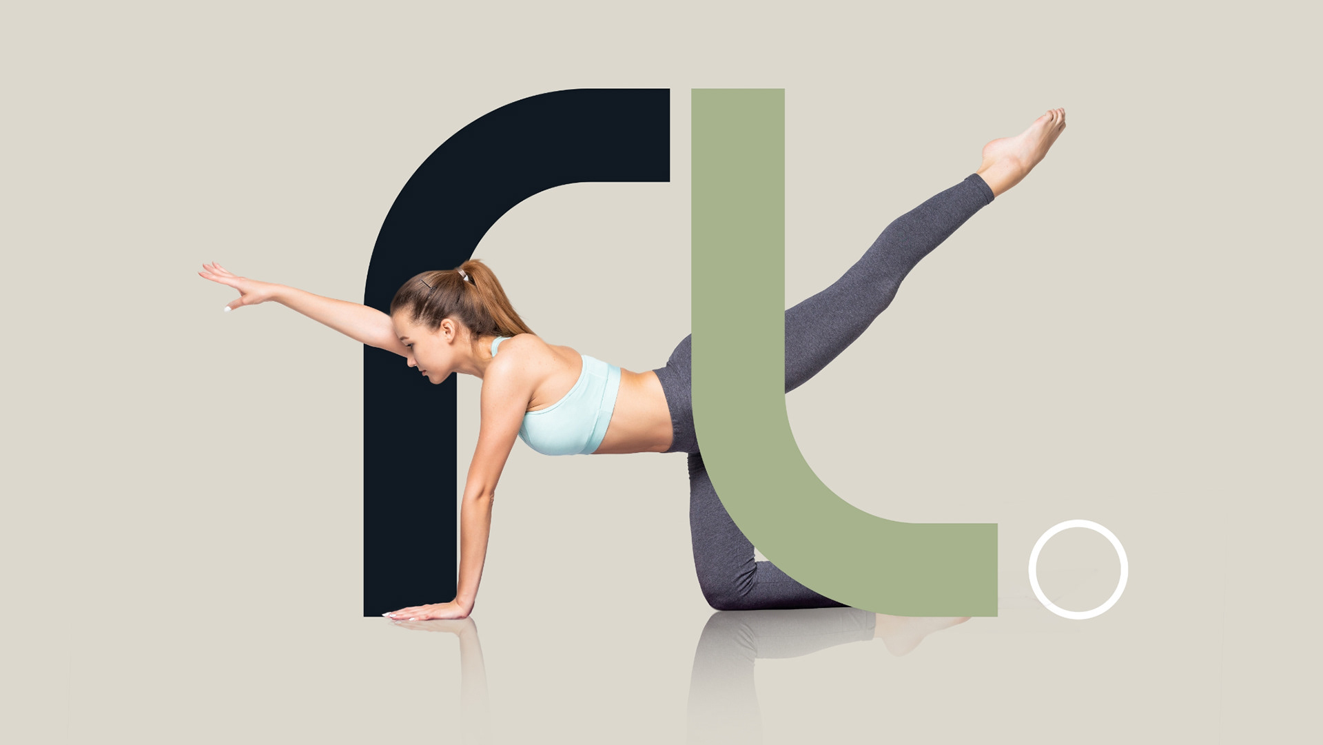
The primary icon of this design focuses on the letters ‘R’ and ‘L,’ presented as a mirrored image to accentuate a smoothly flowing tone of voice.
The selected colours aim to convey a feeling of reassurance, incorporating both masculine and feminine elements. The chosen font further suggests a sense of informal, free-flowing expression. From this, we were able to develop a unique colour styling approach to their imagery which gave the brand originality and also ensured a recognisable consistency across all social media platforms.
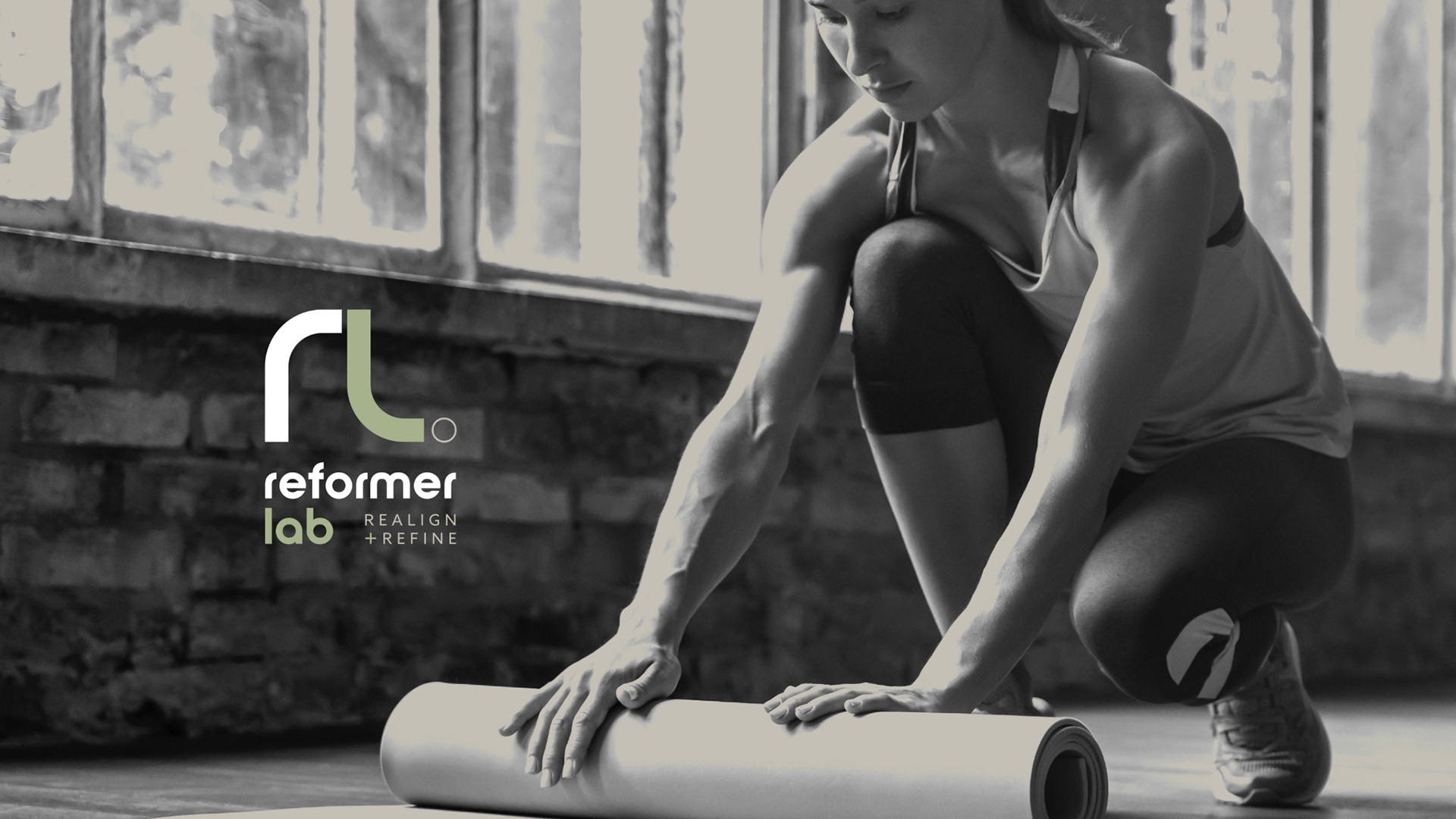
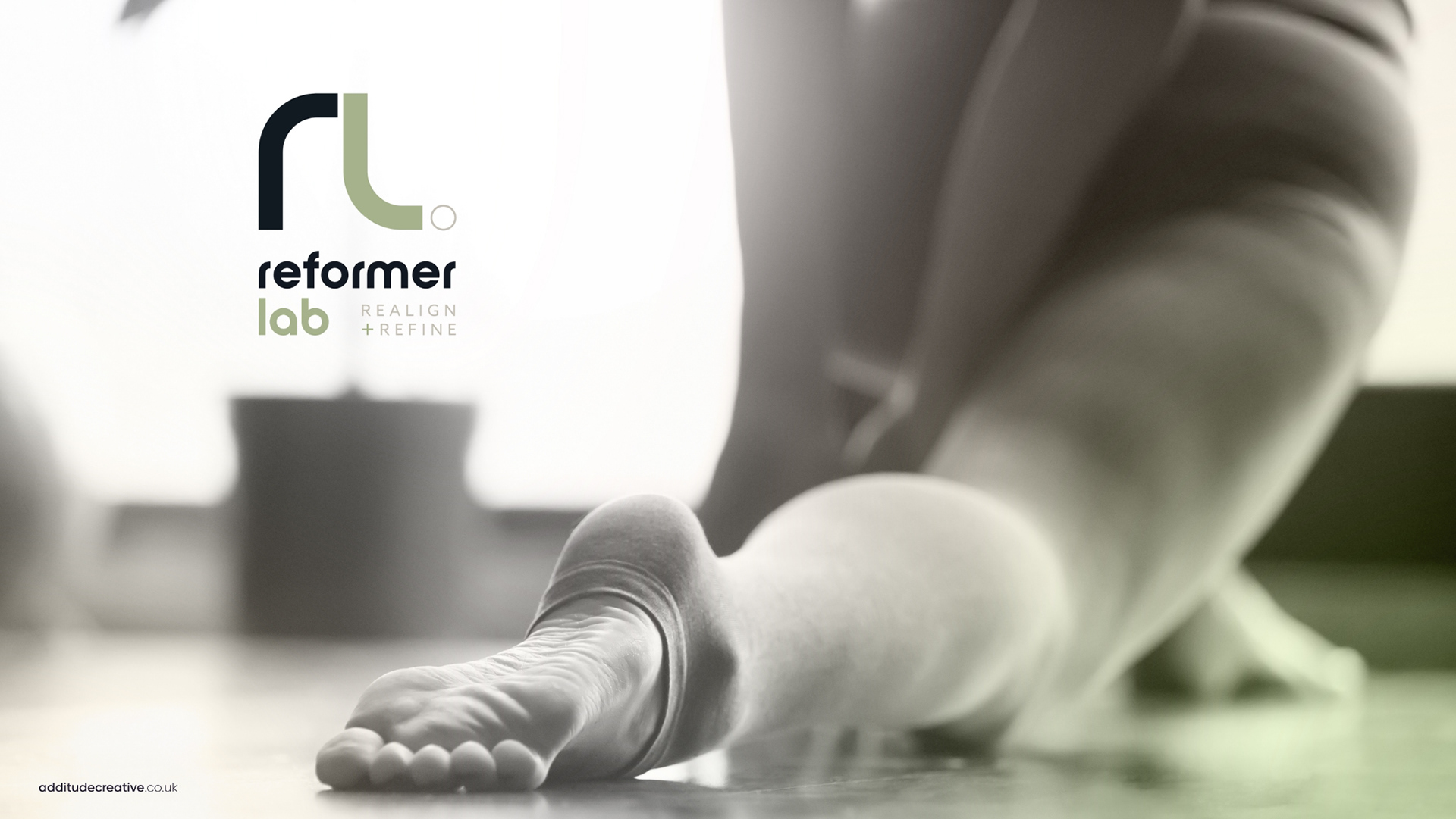
The design will soon roll out across all of their marketing collateral, studio and Reformer Lab online presence.